 Logo courtesy of The J. M. Smucker Co.
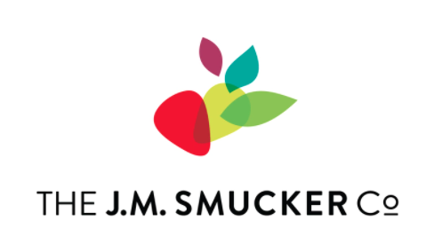
 The J.M. Smucker Co. unveiled their “updated corporate identity” to better reflect their company’s diverse portfolio, category expertise and multi-generational appeal.
The most noticeable change to the company, is the new logo and overhauled brand identity. For the past 30 years, the Smucker’s visual identity has borrowed heavily from its namesake line of jams, jellies and preserves. With the company’s portfolio growing dramatically to also include leading brands in the coffee, pet food, pet snacks, peanut butter and snacking categories, a fresh visual identity that pays homage to their origins while also reflecting its growth ambitions was needed.
“Given our ambitions of continued transformational growth, it is important our identity reflect the Company we’ve grown to become and the one we aspire to be,” said Mark Smucker, president and CEO of The J.M. Smucker Co in a press release. “Our new identity will aid our efforts to attract additional talented professionals, reinforce our category expertise with customers and suppliers and create greater awareness of the value we bring to our partners helping to spur new opportunities.”
During the past two decades, the Company has thoughtfully grown from an $800 million jams and jellies business to a more than $7 billion multi-category CPG leader but is still largely known for its namesake products.
“We have a tremendous portfolio of brands, products that appeal to every generation of consumers and employees who are passionate about operating responsibly,” added Smucker. “With this new identity, we are able to shine a light on what makes us unique and give people a reason to learn more about how we’re using our business to positively impact people and pets.”
“The development of the new visual identity was a highly collaborative process with The J.M. Smucker Co. team,” said Rick Barrack, chief creative officer and co-founder of CBX – the firm selected to partner with the company. on the logo and visual system. “Recognizing the company’s history and five generations of family leadership, we were inspired by their past. But what’s really exciting is where the company is today, their culture and their continued growth. The new identity uses the familiar strawberry to anchor the mark, a pivot point to convey change, and the movement of shapes to express the future. We think it captures the essence of their organization, while giving a nod to their heritage.”
Print this page
Leave a Reply